
Let’s say you’re writing an application, and you want to give it a conversational interface: your users will type some command, and your application will do something in response, possibly after asking for clarification.
There are lots of terms associated with this technology — conversational commerce, bots, AI agents, etc. I think it’s much clearer to call it a Linguistic User Interface (LUI), by analogy with the Graphical User Interface (GUI) you could attach to the same application.
Imagining your application with a GUI is a good antidote to potentially woolly thinking about “AI agents”. You still need to wire the UI to the underlying application, and the conceptual model of your underlying application is still going to play a dominant role in the overall user experience.
Your User’s Text is Like a Click
Let’s say you have a simple application, capable of executing four functions:
check_weather(): Show the current weather and tomorrow’s forecast.check_calendar(): Show today’s appointments.call_mom(): Call your mother.tell_joke(): Tell a corny joke.
Imagine writing a GUI for this application from scratch. The user moves the cursor and clicks. On each click, you get a pair of numbers, representing the cursor’s position. So, each user action gives you a vector of two real values. Your application knows the bounding-boxes of its four buttons. For each vector, you check whether the point falls within the bounds of one of your buttons. If it does, you trigger the button-press animation, and execute the appropriate function.
To write a LUI from scratch, we must take the user’s text and resolve it to a vector of numbers. We must figure out “where” the user has “clicked”. Typically we map each word to an arbitrary ID. Then if we recognise a 5,000 word vocabulary, we can regard each word as a distinct point in a 5,000 dimensional space. Then we reduce this space to a denser space of, say, 300 dimensions. This takes us much of the way to resolving the text to a manageable meaning vector.
word_to_value = {    'show': 0.1, "what's": 0.3, 'check': 0.3, 'tell': 0.4, 'call': 0.7,    'news': 0.3, 'weather': 0.3, 'joke': 0.1, 'mom': 0.9}
def get_coords(text):    values = []    for word in text.split():        if word in word_to_value:            values.append(word_to_value[word])    return (values[0], values[-1]) if values else (0.0, 0.0)
To illustrate this, let’s recognise a vocabulary of a few words, and assign a real value to each word. To map the user’s text to two dimensions, we’ll take the first word we recognise as the x coordinate, and the last word we recognise as the y coordinate.
The simple function above lets us represent the “meaning” of the user’s text as a pair of two real values:
| Function | X | Y |
|---|---|---|
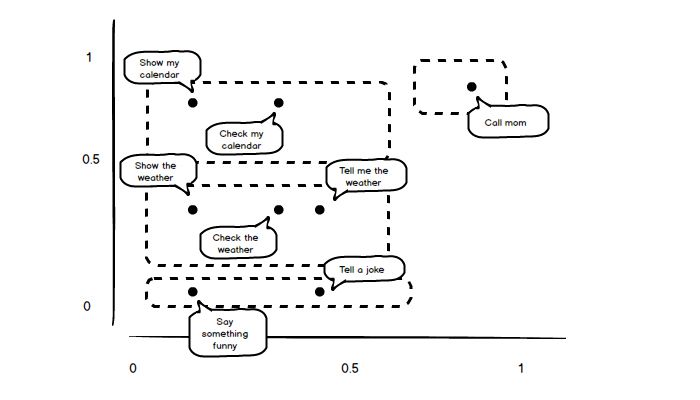
get_coords("check the weather") | 0.3 | 0.3 |
get_coords("show my calendar") | 0.1 | 0.7 |
get_coords("say something funny") | 0.1 | 0.1 |
get_coords("call mom") | 0.9 | 0.9 |
We can complete the analogy between the LUI and the GUI by plotting out these values, and proposing some boundaries for our “buttons” — our application’s actions.

With a GUI, there’s no trouble determining the coordinates of the click, and you never have to think about resolving the click event to a particular button, if any. That stuff just happens — it’s taken care of for you. With a LUI, you have to pay attention to these details. You can do a better or worse job at this, but the “gold standard” — the holy grail of all your machine learning efforts — will only ever give you something you’ve been taking for granted all along in a GUI. Of course, you have a vastly bigger, multi-dimensional canvas on which the user can “click”, and each click can give you richly structured data. But you still have to paint buttons, forms, navigation menus etc onto this canvas. You’re still wiring a UI to some fixed underlying set of capabilities.
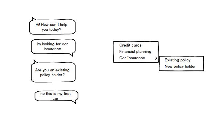
Consider a dialog like this:
- Hi! How can I help you today?
- I’m looking for car insurance.
- Are you an existing policy-holder?
- No this is my first car
Let’s say that under the hood, the user’s final utterance triggers the function
car_insurance.non_holder.tell(), which prints a wall of text. The LUI here
gives the user a hierarchical menu, whose options are determined by the
underlying domain. In GUI design, the problems posed by nested menus are well
known, and it’s easy to imagine analogous problems for a LUI.
If you’re looking at the top of a nested menu, how do you know what the leaves of the tree are? And if you know you need a particular leaf, how do you reliably guess how to navigate to it? The LUI prompts give you more text, so the context might sometimes be clearer. On the other hand, the range of options available is not always enumerated, and your intent might be misclassified.

My point here is that a linguistic user interface (LUI) is just an interface. Your application still needs a conceptual model, and you definitely still need to communicate that conceptual model to your users. So, ask yourself: if this application had a GUI, what would that GUI look like?

A GUI version of Siri would probably give you a home-screen with pages of form elements, one for each of Siri’s sub-applications. There would also be a long list of buttons, to trigger Siri’s atomic “easter egg” functions. Note that the GUI to Siri would not simply be the home-screen of iOS. If that were true, then Siri would be mapping your utterance to a sequence of touch events and user inputs.
When you say, “Tell my mother I love her”, Siri executes the command
sms("my mother", "I love her"). It definitely doesn’t execute a sequence of
user actions, that “pilots” your iPhone the way you do. Trying to do that would
be insane. Siri is just an app, with its own conceptual model of actions you’re
likely to want to perform. It exposes those actions to you via a LUI rather than
a GUI.
What couldn’t we do yesterday?
I think it’s important to understand exactly what opportunities the new and improved AI technology is opening up. A LUI is feasible now because you can expect to be able to catch the user’s “click” and resolve it to the correct action reasonably accurately. You can now expect to interpret the user’s text quite well. That’s new, and the opportunity is interesting. But the opportunity is also much more narrow than many people seem to think.
I think a LUI can be particularly nice for filling complicated forms, where you have a lot of arguments that are seldom used. However, the more precise I want to be, the less excited I am to use natural language. My NL query is going to get mapped into a database query, and the structure of the table I’m querying is pre-determined. It can be both good and bad that the structure of the table is hidden from me.
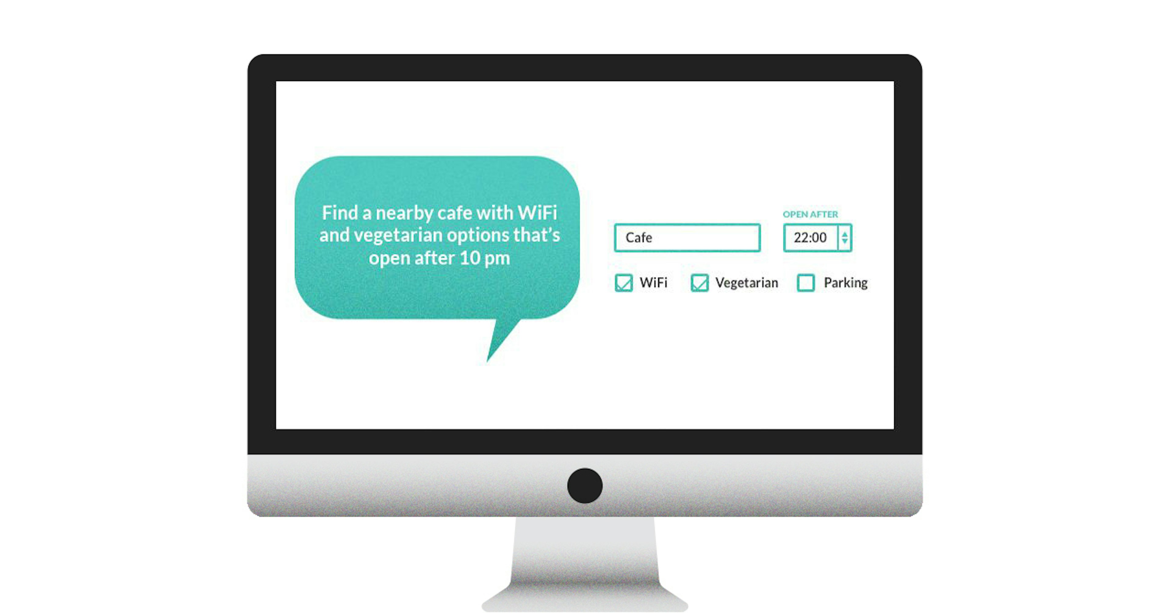
The advantage is that the structure of the table can change without me having to change my interaction with the UI. The disadvantage is that I’m being lied to — I’m being forced to interact with the application over a leaky abstraction. Probably if I want to find a nearby cafe with WiFi and vegetarian options open after 10 p.m., I’d be excited to use an NL interface. If I’m booking a flight to Australia, I’d rather open my laptop and fill in a web form.

Unless you’re compiling the user’s instructions into code and evaluating it (which I wouldn’t advise!), a LUI does not introduce any additional expressivity. Linguistic user interfaces and graphical user interfaces are both…user interfaces.
The linguistic interface might be better, or it might be worse. It comes down to design, and your success will be intimately connected to the application you’re trying to build. The problem is that we’ve got vastly less experience designing LUIs, and users have vastly less experience using them.
My prediction is that there will be a strong second-mover advantage for people building applications with linguistic user interfaces. Lessons about UI design will need to be relearned, and a culture of usage assumptions will have to accrue. In the meantime, I expect LUIs to fit best for relatively humble applications that are excited about cutting costs and piggy-backing on popular platforms.
In other words, I think LUIs fit best for small and scrappy teams making small investments. If you’ve got a big bold plan, and your ambition includes giving your application a “unique user interface”, you should be careful what you wish for. That’s like hoping to live in interesting times.


