- 10 minute read
- Blog
- Part-of-Speech Tagging
- Dependency Parsing

With new offerings from Google, Microsoft and others, there are now a range of excellent cloud APIs for syntactic dependencies. A key part of these services is the interactive demo, where you enter a sentence and see the resulting annotation. We’re pleased to announce the release of displaCy.js, a modern and service-independent visualization library. We hope this makes it easy to compare different services, and explore your own in-house models.
Update (Feburary 2018)
As of spaCy v2.0, the displaCy visualizer is integrated into the core library. It supports serving the visualizations in the browser, generating the raw markup or outputting the results in a Jupyter notebook. For more details, see the visualizers documentation.
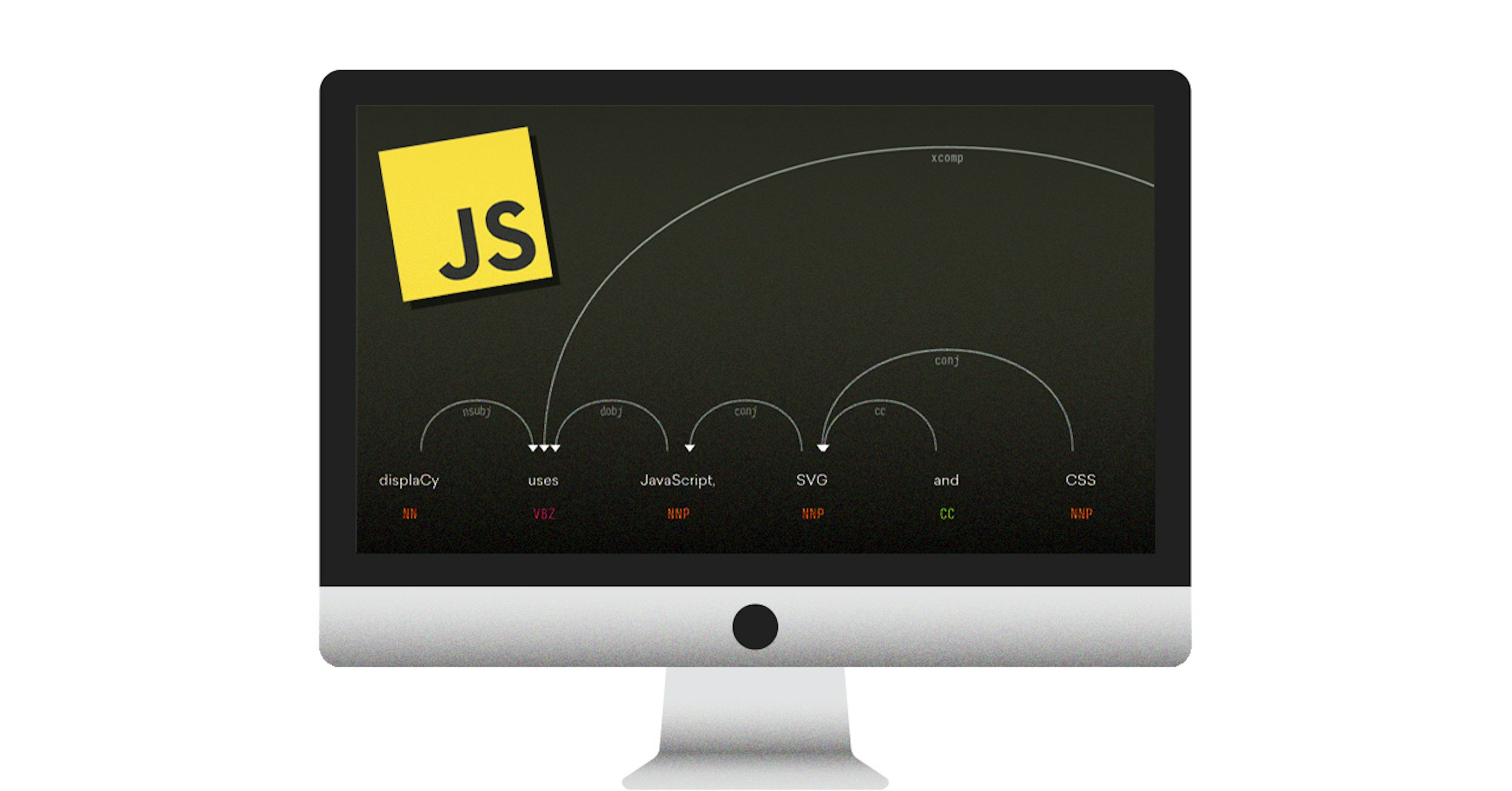
Here’s an example of a sentence rendered by the new SVG-based displaCy:

Using displacy.js in your projects
Simply include displacy.js and initialize a new instance specifying the API and
settings. The parse(text, model, settings) method renders a parse generated by
spaCy as an SVG in the container. By default, it expects
spaCy’s services, which you can
download and run for free. If you’re using
Google’s NLP API
instead, set format to 'google'.
// Your APIconst api = 'http://localhost:8000'
// Init displaCyconst displacy = new displaCy(api, {  container: '#displacy',  format: 'spacy',  distance: 300,  offsetX: 100,})
// Parse sentencedisplacy.parse('This is a sentence.', 'en', {  collapsePunct: false,  collapsePhrase: false,  color: '#ffffff',  bg: '#000000',})
For a full list of available settings, see the
Readme. Alternatively,
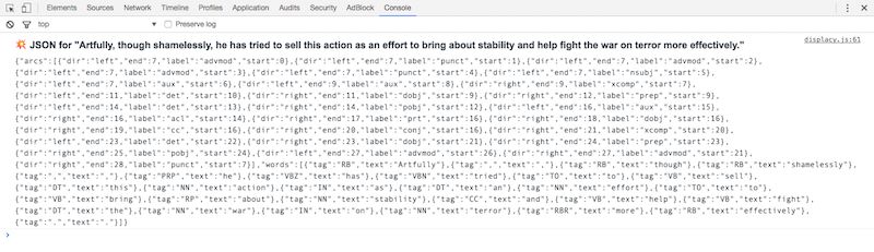
you can also use render(parse, settings) to manually render a JSON-formatted
set of arcs and words. displaCy logs the JSON representation of each parse to
the console for quick copy-pasting:
How displaCy works
A dependency visualization consists of three main components:
- words and their corresponding part-of-speech tags displayed horizontally in order
- arcs of different lengths connecting two words with corresponding labels showing their relation type
- an arrow head at the start or end of each arc indicating its direction
All three components can be implemented using the
SVG elements
<path></path> and <text>, with <tspan> to separate spans of text and
<textPath> to wrap the arc label along the rounded arc path. Let’s take a look
at the first word, “Robots”, and the arrow connecting it to “are”. This is a
simplified example of the markup displaCy generates:
Example SVG markup (excerpt)
The above markup was generated from JSON data that looked like this:
Example JSON from API (excerpt)
To translate the JSON-format into SVG markup, we need two main functions: one to draw the words, and one to draw the arcs.
Drawing the Words
Rendering the words is pretty straightforward because they are independent of
the overall sentence. Each word needs two coordinates: x, the distance from
the left, and y, the distance from the top. Starting at a fixed offset from
the left, the first word will be placed at offsetX, the second word at
offsetX + distance, the third word at offsetX + 2 * distance and so on. This
can be broken down into a simple formula, offsetX + i * distance. Let’s not
focus too much on the y coordinates for now, as they’re pretty much identical
for all components — for the words, I’m merely adding a little spacing so
they’re not too close to the arrows.
const offsetX = 150;    // distance from the leftconst distance = 300;   // distance between words
// Iterate over wordsconst markup = words.map(({ text, tag }, i) => `    <text y="${offsetY + wordSpacing}" text-anchor="middle">        <tspan x="${offsetX + i * distance}">${text}</tspan>        <tspan x="${offsetX + i * distance}" dy="2em">${tag}</tspan>    </text>`.trim()).join('');
Drawing the Arcs
Each arc comes with the index of its start and end point, making it trivial to
calculate its length: end - start. This makes the start point of an arc
offsetX + start * distance and the end point
offsetX + (end - start) * distance. Now if we add these numbers to our path
definition, we get a nice straight line connecting both points:
<path stroke="currentColor" d="M150,400 950,400" />The curves are a little trickier. For each curve, we need to add four additional
values to the path definition: the x and y coordinates of the left and right
cubic bézier control
points. To show how this looks, I’ve forked
this great demo
from SitePoint. You can move the control points around and see how it affects
the <path> markup:
The curve’s height needs to adapt to the arc’s length. An arrow spanning over three words needs to be higher than an arrow spanning over two – otherwise they’ll overlap.
Depending on the grammatical strucutre of the sentence, we usually end up with a
lot of arcs with lengths of 1 and 2, connecting words to their next and
second next neighbours, then one or two arrows with lengths of 3 or 4, and
maybe a large one with a length of 10. Long dependencies like that are
especially common with relative clauses, questions and punctuation, and in
languages like German, where verbs and verb prefixes are often placed at
the end of the clause.
If we use only the length of an arc to calculate its curve, we quickly run into a problem when visualizing complex sentences: the largest arrows become huge and produce too much whitespace, rendering the visualization pretty much unusable.

The largest arrow’s height here is relative to its length of 21, even though a
height relative to a length of 8 would have sufficed to still make it higher
than the second largest one. We can solve this by generating a list of all
occuring lengths in order. When rendering the arc, we can now use the index of
each length (+ 1, to start with level 1).
// Create an array from a set to avoid duplicate values and sortconst levels = [...new Set(    arcs.map(({ end, start }) => end - start).sort((a, b) => a - b))];// [1, 2, 3, 4, 5, 6, 7, 21]
// Get level for arcconst arc = { dir: "right", end: 28, label: "punct", start: 7 };const level = levels.indexOf(arc.end - arc.start) + 1);// 8
We can now generate arrows and their curves relative to the overall levels:
// Get highest level (index + 1 of highest length value)const highestLevel = levels.indexOf(levels.slice(-1)[0]) + 1
const offsetX = 150 // distance from the leftconst distance = 300 // distance between words
const startX = offsetX + start * distanceconst startY = (distance / 2) * highestLevelconst endpoint = offsetX + (end - start) * distanceconst curve = startY - ((end - start) * distance) / 2
// Combine values for path definitionconst d = `M${startX},${startY} C${startX},${curve} ${endpoint},${curve} ${endpoint},${startY}`
// Generate path markupconst path = `<path d="${d}" stroke-width="2px" fill="none" stroke="currentColor" ></path>`
The arrow head is simply a path forming a triangle that is placed either at the
start or the end of the arc. To wrap the label along the middle of the arc path,
we can take advantage of the <textPath> element and link it to the id of the
arc:
<path id="arrow-0" d="..."></path><textPath xlink:href="#arrow-0" startOffset="50%" text-anchor="middle">Label</textPath>Styling the visualization with CSS
To allow custom styling, all elements contained in the SVG come with tags and
data attributes. By default, the currentColor of the element is used for
colouring, meaning you only need to change the color property in CSS.
For example, arrows have the class .displacy-arrow as well as a data-label
and data-dir attribute. Using a combination of those selectors and some basic
CSS logic, you can create pretty powerful templates to style the elements based
on their role and function in the parse.
/* Make all noun phrases (tags that start with "NN") green */.displacy-tag[data-tag^='NN'] {  color: green;}
/* Hide all tags for verbs (tags that start with "VB") that are NOT the base form ("VB") */.displacy-tag[data-tag^='VB']:not([data-tag='VB']) {  display: none;}
For more CSS examples, see the Readme.
Using displaCy with Harp or Node / Express
Since SVG graphics consists of basic XML, we can use a templating engine like Jade (Pug) to dynamically generate the markup. For this blog, I wrote a simple mixin that generates a static inline SVG for any given JSON representation of a parse. It’s even more compact than displacy.js (less than 50 lines!) and is available here. It works with Jade-based static site generators like Harp, or Node applications using Express, which natively supports Jade templates.
To use the mixin, include it at the top of your file and call +displacy() with
the full parse object as its argument:
include _displacy+displacy({ arcs: [ ... ], words: [ ... ] })To add custom class names to individual arcs, you can add a style: "classname"
to the respective arc object. We’ve used this feature
in this post to illustrate a
correct dependency vs. an incorrect dependency in one graphic.
What’s next?
We’re planning support for more annotation formats like CoreNLP. In the meantime, you can can add your own custom converter. We’ve also launched a modern and lightweight Named Entity visualizer — stay tuned for another in-depth blog post!
Update (Feburary 2018)
As of spaCy v2.0, the displaCy visualizer is integrated into the core library. It supports serving the visualizations in the browser, generating the raw markup or outputting the results in a Jupyter notebook. For more details, see the visualizers documentation.


